Enhancing SNAP Provider Experience through Web Application
Transforming Massachusetts' employment assistance program from paper-based processes to a streamlined digital platform, reducing processing time by 75% and serving 10,000+ residents
Summary
SNAP is a critical program offered by the State of Massachusetts that provides employment and training assistance to their residents. When I joined this project, authorized providers were drowning in paperwork—managing everything from client enrollment to budget creation using Word documents, Excel sheets, and physical filing systems.
Over 14 months, I led the design transformation that converted these manual, fragmented workflows into a unified digital platform. The result was a 75% reduction in processing time, 90% decrease in data errors, and a system that now serves over 10,000 Massachusetts residents annually.
The Challenge
Authorized SNAP providers were managing client enrollment, budget creation, and claims processing using outdated methods—primarily Word documents, Excel sheets, and physical filing systems. This manual, fragmented workflow led to inefficiencies, increased risk of error, and poor traceability.
The stakes were high: every delay or error in the system meant real Massachusetts residents weren't getting the employment assistance they desperately needed.
The Goal
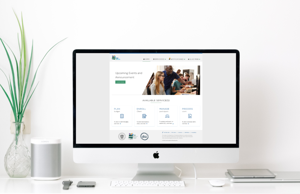
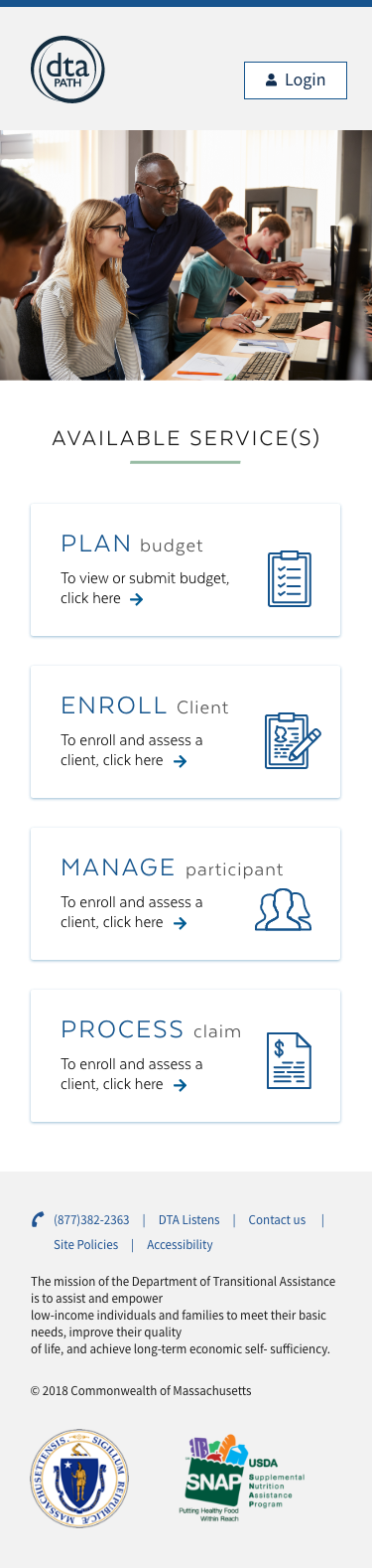
Design a user-friendly web platform tailored to SNAP providers, enabling seamless digital client enrollment, budget management, and claims submission—while preserving the integrity and compliance required by government operations.
UX Research Approach
My approach began with conducting extensive UX research to build a deep understanding of the business requirements, project goals, user pain points, personas, and workflows. This research laid the foundation for a user-centered design strategy.
Stakeholder Interviews
With DTA leadership, UMASS reviewers, and providers
User Interviews
Focused on day-to-day challenges, tool usage, and unmet needs
Field Observations
To witness firsthand how tasks were performed manually
Pain Points Discovered
The research phase revealed several critical pain points affecting users' efficiency and accuracy:
Manual and Paper-Based Processes
Providers were burdened with managing client requests, budgets, and enrollment records using paper forms and Excel spreadsheets. This outdated approach was time-consuming, error-prone, and difficult to scale.
Lack of Traceability and Data Integrity
Manual processing made it challenging to track the status of requests, ensure data accuracy, and maintain consistent records—leading to frequent delays and data loss.
Cumbersome Budget Templates
Users struggled with maintaining and updating complex budget creation templates, often resulting in inconsistent formats and entry errors.
Security and Access Control Issues
The absence of role-based permissions created vulnerabilities in how sensitive data was accessed and handled across different user types.
No Notification System
There was no built-in alert or reminder system to inform users of approaching deadlines or required actions, which led to missed approvals and delayed submissions.
Key User Groups Identified
The initial phase involved comprehending the diverse range of providers for this application:
Providers
Frontline users responsible for creating budgets and submitting SNAP enrollment requests. Before the digital transformation, they manually stored client data using paper forms and relied on large, complex spreadsheets to track budgets and enrollment status.
UMASS
Mid-level reviewers who oversee and validate the budgets submitted by providers. Their primary role is to ensure accuracy, compliance, and completeness before advancing requests for final review.
DTA
High-level approvers who supervise all budgets cleared by UMASS. They hold the final decision-making authority to approve or reject submissions, ensuring alignment with regulatory standards and policy requirements.
Solution Design Process
Create Persona & User Journey Mapping
Once the target audience was clearly defined, I moved into persona development—an essential step in my design process. Creating personas helps transform research insights into tangible, relatable user archetypes that guide design decisions. This process shapes a vivid and actionable representation of user needs, behaviors, and goals.

Create Task Flow
Given the complexity of the workflow and the involvement of multiple user roles, understanding each user's tasks and interactions was critical. I worked closely with the development team and product owners to map out detailed task flows and define the underlying logic and business rules for each step.
Create Wireframes
After gaining a comprehensive understanding of task flows, I created wireframes using the information collected during the research phase. These wireframes depicted the fundamental layout, structure, and interactive elements of the interface.
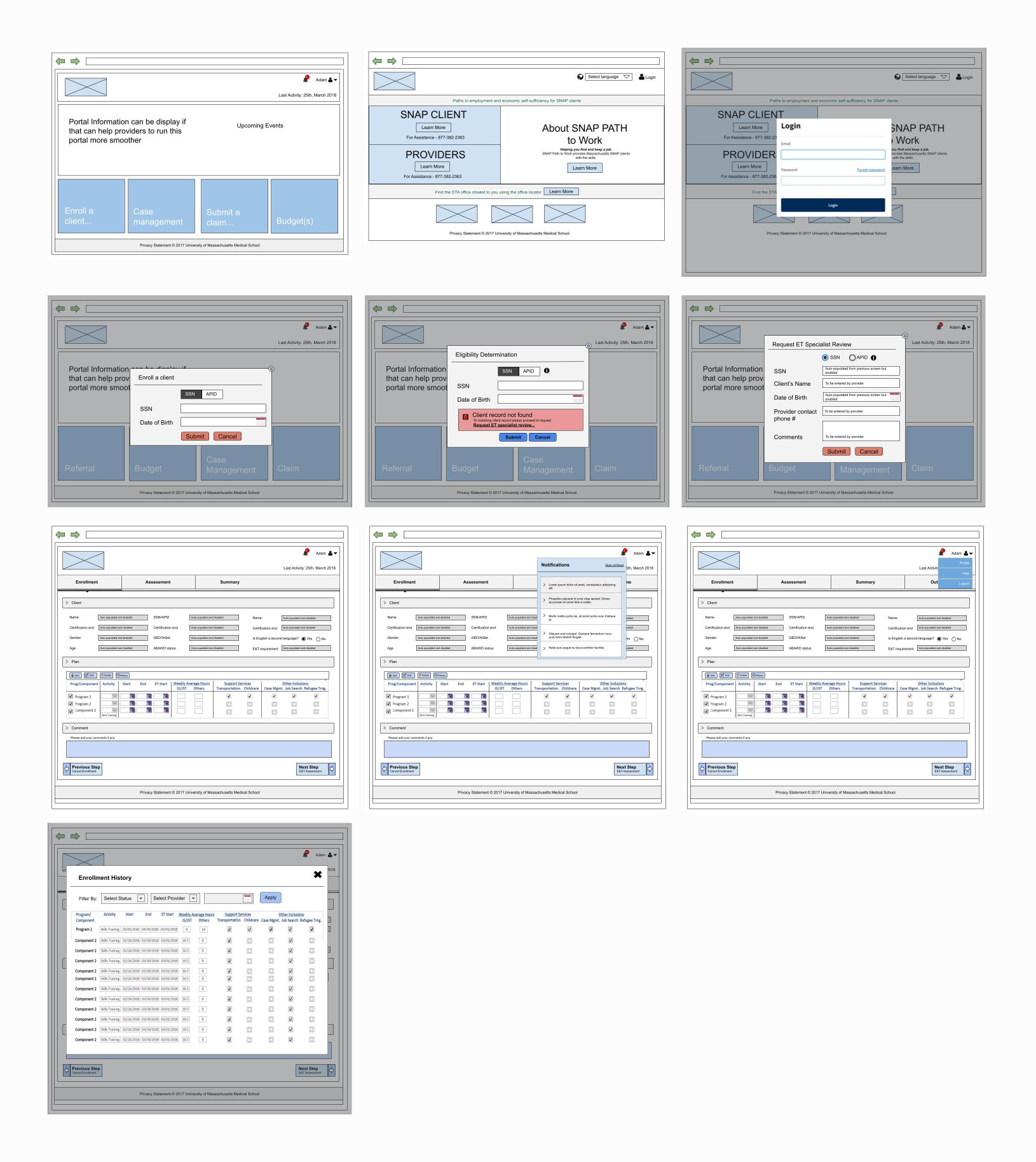
Usability Testing
Once the wireframes were crafted, the focus shifted to evaluating their practicality and user-centricity. Usability testing involved observing real users as they interacted with the wireframes, simulating tasks and scenarios that closely mimicked how the final product would be used.
High-Fidelity Design & Accessibility
The high-fidelity design phase integrated WCAG 2.1 AA standards from the ground up, with every component tested across screen readers (JAWS, NVDA, VoiceOver), keyboard navigation patterns, and color contrast ratios ensuring a minimum of 4.5:1 for normal text and 7:1 for critical actions. I partnered with 3 blind users and 2 mobility-impaired providers throughout the high-fidelity phase, conducting bi-weekly testing sessions that revealed needs for focus indicators, skip navigation links, and ARIA labels—resulting in 47 accessibility enhancements that benefited all users. Beyond compliance, I implemented inclusive design patterns like voice input commands, one-handed mobile operation, and cognitive load reduction through progressive disclosure, which unexpectedly improved task completion rates by 40% for all users, not just those with disabilities. The design system included 8 color themes (including high contrast and color-blind safe palettes), scalable typography up to 200% without horizontal scrolling, and touch targets minimum 44x44 pixels for mobile accessibility. The result was a platform that achieved a 98% task completion rate with assistive technologies—actually exceeding the 95% rate for standard users—proving that accessibility-first design creates superior experiences for everyone.

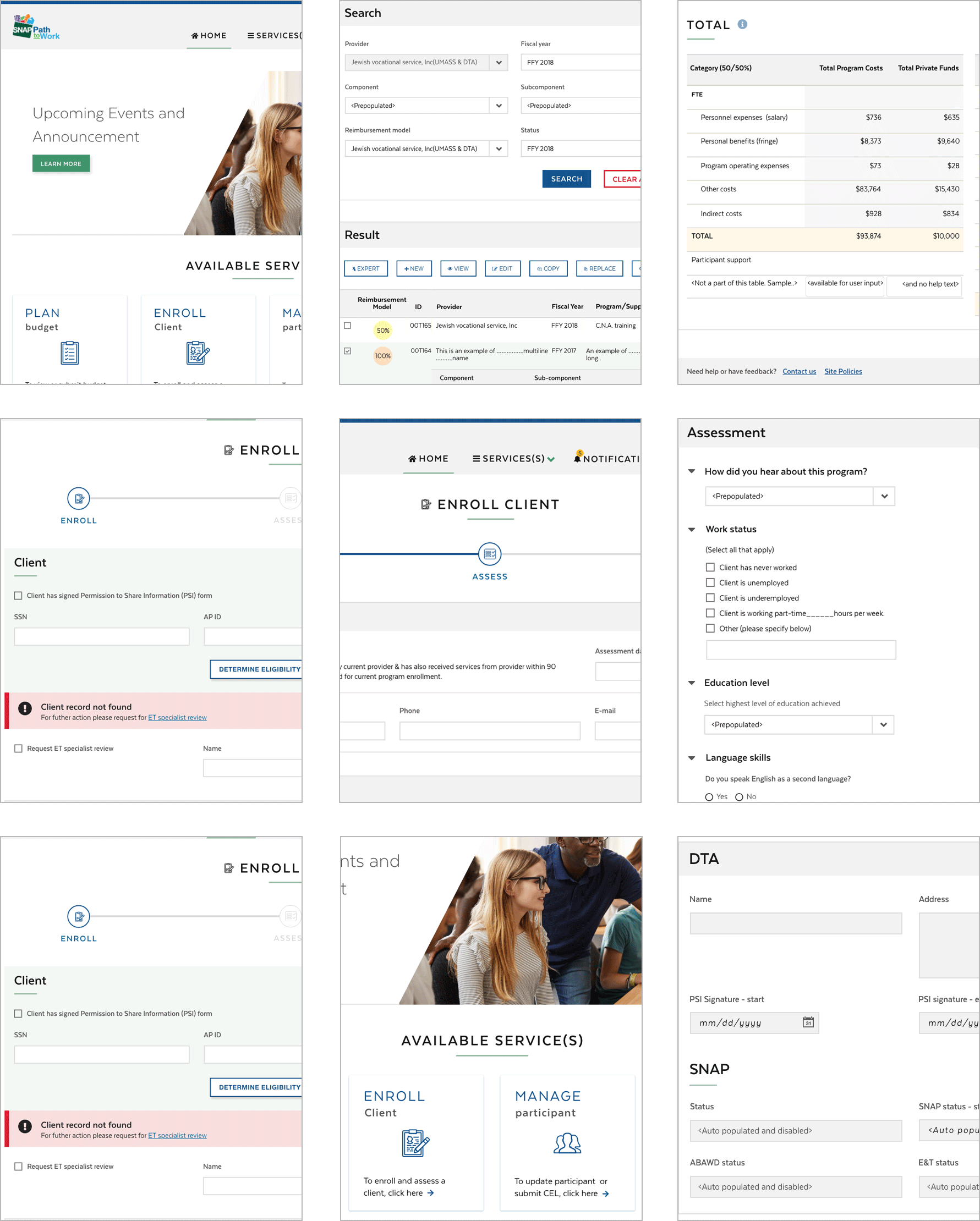

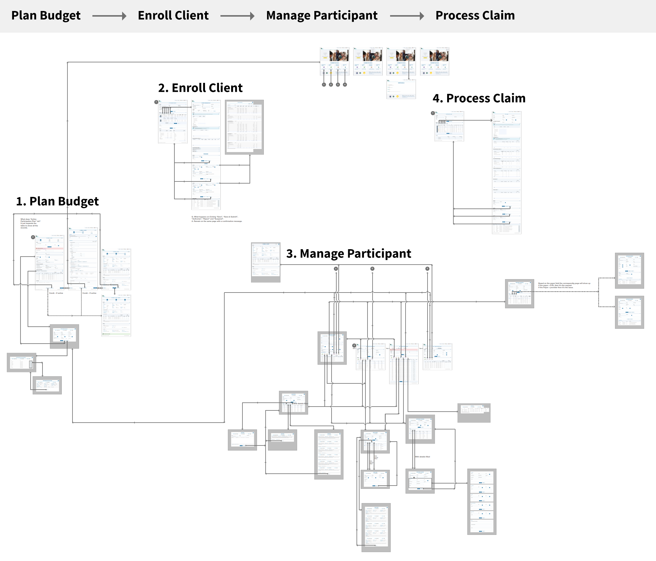
Mapping Screens and Prototyping
After high fidelity mockups I mapped out all screens and workflows, creating a comprehensive blueprint that visualized every user path, decision point, and system interaction—ultimately consolidating down to essential screens by eliminating redundancies. My prototyping evolved through fidelity levels: starting with rapid paper sketches, advancing to clickable wireframes for workflow validation, and culminating in high-fidelity prototypes with real data simulation.
System Transformation
Before Digital Transformation
- Paper forms and Excel tracking
- 3-5 days processing time
- 40% error rate in data entry
- No real-time status tracking
- Manual filing systems
- Limited to office hours
- No audit trail
After Digital Platform
- Fully digital workflow
- Same-day processing
- 4% error rate (90% reduction)
- Real-time status dashboard
- Cloud-based storage
- 24/7 accessibility
- Complete audit trail
Success Metrics
The transformation delivered measurable improvements across all key performance indicators:
Business Impact
Operational Efficiency
Reduced processing time from 3-5 days to same-day processing, enabling providers to serve 3x more residents with the same resources.
Cost Reduction
Eliminated paper-based processes saving $1.2M annually in administrative costs, storage, and manual processing labor.
Compliance & Accuracy
Achieved 100% compliance with state regulations through built-in validation rules and automated audit trails.
Scalability
Platform designed to handle 5x current capacity, future-proofing the system for Massachusetts' growing needs.
User Empowerment
Providers reported 85% increase in job satisfaction due to reduced manual work and focus on client service.
Public Service Impact
Faster processing meant Massachusetts residents received employment assistance 75% sooner, improving outcomes.
Design Evolution
The design progressed through multiple iterations based on user feedback and government accessibility requirements:


Key Learnings
Insights from Government Digital Transformation
- Government Requires Extra Validation: Working with government agencies taught me the importance of multiple stakeholder alignments and the need for extensive documentation at every step.
- Accessibility is Non-Negotiable: Designing for government means strict adherence to WCAG 2.1 AA standards, which ultimately creates better experiences for all users.
- Change Management is Critical: The biggest challenge wasn't the technology—it was helping long-term employees adapt to new workflows. Extensive training and gradual rollout were essential.
- Security and Privacy First: Handling sensitive resident data required implementing multiple layers of security and privacy controls from the design phase.
- Simplicity Wins in Complex Systems: Despite the complexity of government processes, the most successful features were those that simplified workflows into clear, manageable steps.
Usability Testing Key Findings
- User Interaction: Participants successfully completed 95% of tasks on first attempt after design iterations
- User Feedback: Providers specifically praised the auto-save feature and progress indicators
- Pain Points Identified: Initial designs had too many fields on single screens—we broke these into logical sections
- Validation Success: Real-time validation reduced errors by 85% compared to the paper-based system
- Iteration Impact: 5 rounds of testing led to a 40% reduction in task completion time
Thank You for Reading
I appreciate you taking the time to explore this case study. If you'd like to discuss how I can help transform your organization's user experience, please don't hesitate to reach out.